16 Living Room Paint Color Ideas That Look Custom, Not Basic
Living room paint can do much more than cover a plain wall. The right treatment can make a narrow room feel balanced, turn an ordinary fireplace into an architectural feature, warm up weak natural light, or visually separate an open-plan living area without adding a physical divider.
These living room paint color ideas go beyond predictable beige walls and basic accent colors. You will find sculptural arches, painted ceilings, limewashed surfaces, color-drenched rooms, graphic borders, bright window pockets, and unexpected color combinations designed to make a living room look thoughtful and custom.
Whether you prefer cozy earth tones, calming blues, dramatic jewel colors, or modern warm neutrals, each idea offers a distinct atmosphere and visual identity.
Before Choosing a Living Room Paint Color
Before committing to a complete room, test your chosen colors on large sample boards and move them around the space during the day. Paint can appear warmer in afternoon sunlight, cooler beside a north-facing window, and much darker under artificial evening lighting.
Also consider the permanent elements already in your living room, including the flooring, fireplace, stonework, wood tone, sofa, and adjoining rooms. A beautiful paint color should work with these features rather than compete with them.
For a more professionally designed result, choose one clear goal first:
- Brighten a dark room
- Make a small room feel more intentional
- Create a warm and cozy atmosphere
- Highlight an architectural feature
- Connect an open-plan living room and kitchen
- Introduce color without overwhelming the room
1. The Smoky Jade Fireplace Tunnel
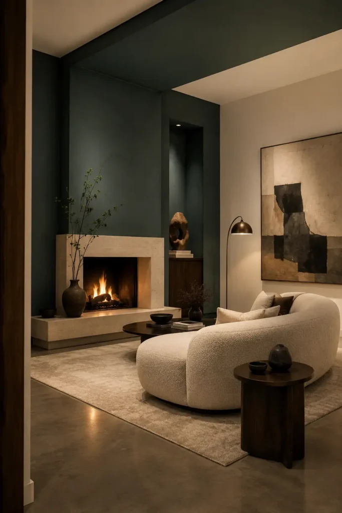
Instead of painting only the chimney breast, carry smoky jade across the fireplace wall and onto a narrow section of the ceiling. This creates the impression of a deep architectural tunnel wrapping around the fireplace.
The treatment makes a standard fireplace feel built-in and sculptural. Because the color extends overhead, the eye reads the fireplace as a complete architectural zone rather than a decorative object placed against the wall.
Color palette: Smoky jade, warm limestone, muted cream, aged bronze
Why it works: It creates depth and makes the fireplace the undeniable focal point
Best for: Modern living rooms, rooms with plain chimney breasts, cozy evening spaces
Style it with: Curved cream seating, dark walnut, ribbed glass, bronze lighting
2. The Apricot Window-Wall Light Well
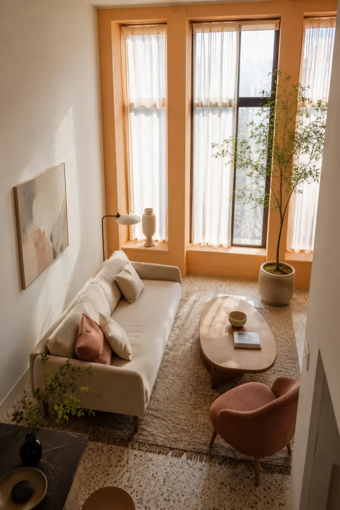
A pale apricot window wall can transform natural daylight into a warm glow. Paint the entire wall containing the main window, including the window recesses, while keeping the other walls creamy white.
This living room paint idea works particularly well when the window is the room’s main source of daylight. The apricot tone catches the light and gently reflects warmth throughout the space without making the entire room feel orange.
Color palette: Pale apricot, creamy white, light oak, dusty rose
Why it works: It warms weak daylight while keeping the room bright
Best for: Small apartments, north-facing rooms, neutral living rooms
Style it with: Light oak furniture, ivory linen, blush textiles, translucent curtains
3. The Cobalt Ble Horizon Wrap
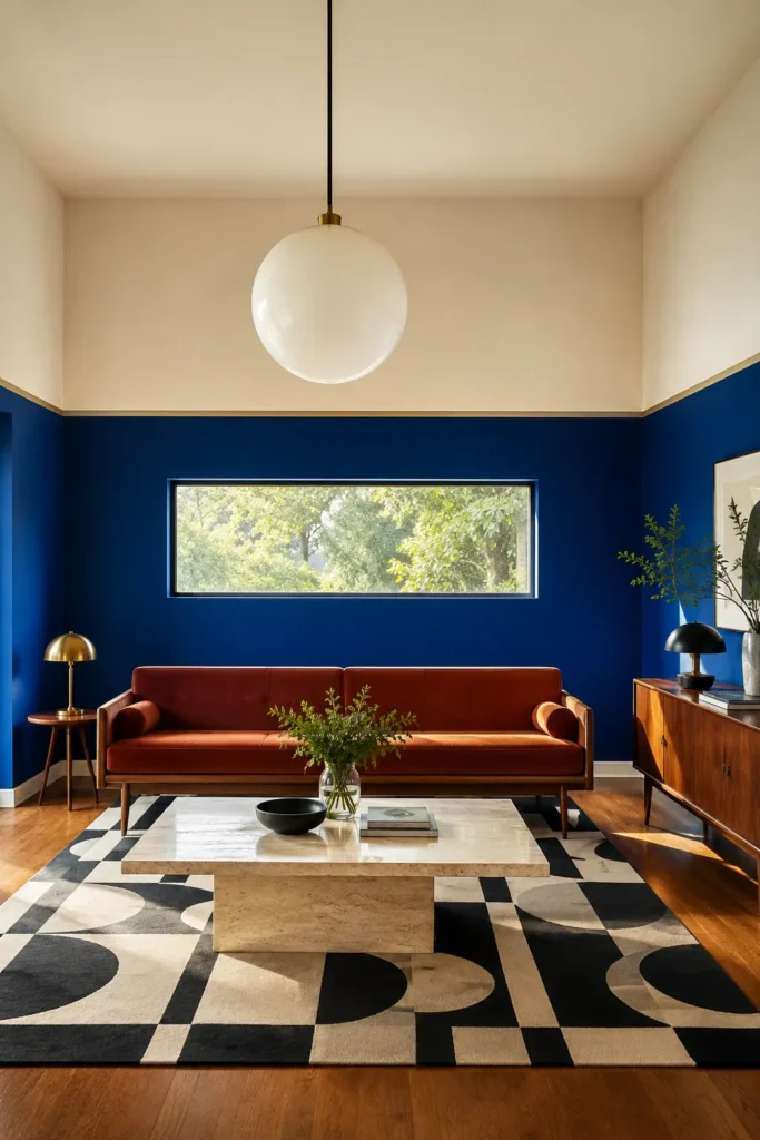
Paint the lower two-thirds of the living room walls in rich cobalt blue, then separate it from the warm ivory upper section with a narrow continuous line.
Unlike ordinary half-painted walls, the unusually high division creates a bold enveloping effect. The thin contrasting line gives the treatment a polished, graphic finish and visually connects every wall.
Color palette: Cobalt blue, warm ivory, rust, dark oak
Why it works: The continuous horizon line makes the room feel cohesive and designed
Best for: Mid-century living rooms, creative homes, rooms with high ceilings
Style it with: Rust upholstery, dark wood, geometric textiles, opal lighting
4. The Mushroom Color-Drenched Cocoon
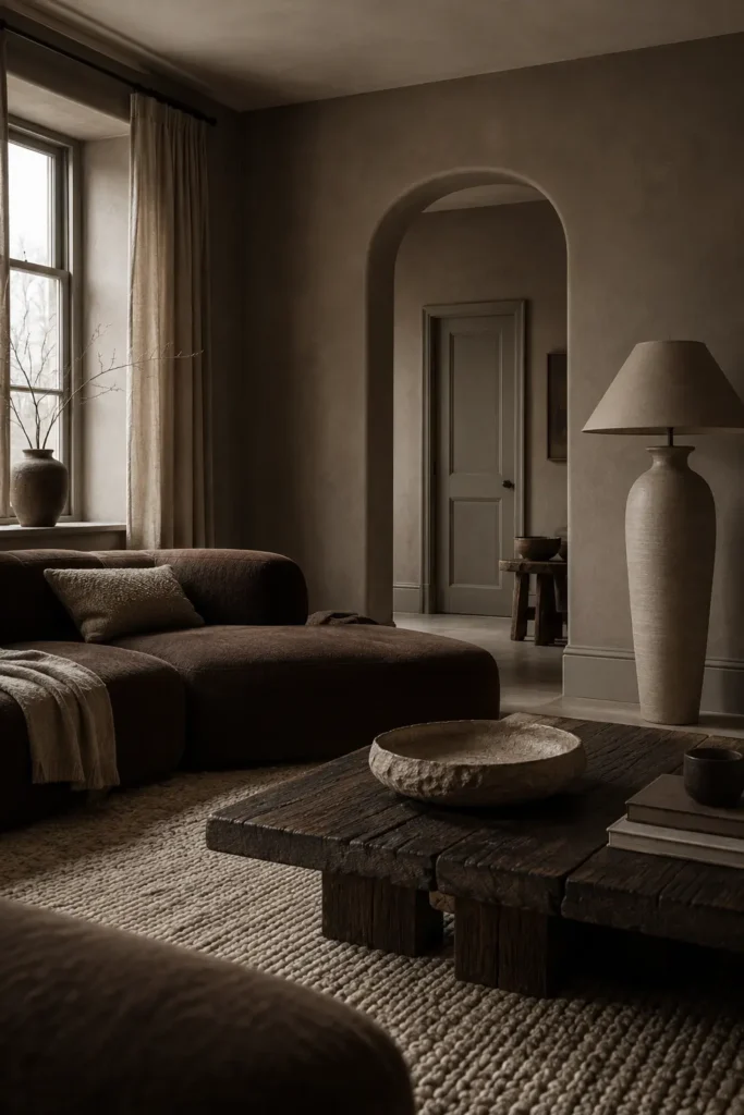
Use several closely related mushroom shades across the walls, trim, doors, and ceiling. The colors should remain within the same family, but slight shifts in depth and finish will prevent the room from looking flat.
A matte wall finish paired with satin trim allows light to reveal the architecture quietly. This creates a soft, calming space that feels warmer than grey and more sophisticated than standard beige.
Color palette: Mushroom taupe, putty, parchment, dark espresso
Why it works: Tonal layering creates depth without strong contrast
Best for: Cozy living rooms, low-light spaces, warm minimalist interiors
Style it with: Boucle, dark wood, handmade ceramics, textured wool
5. The Terracotta Sun Arch
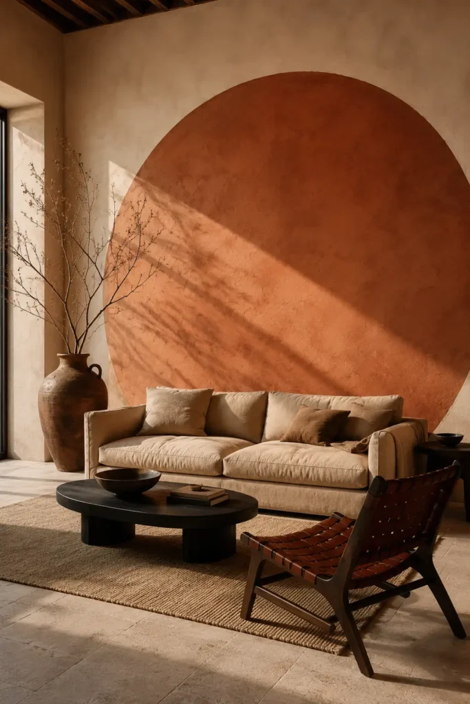
Paint an oversized terracotta semicircle behind the sofa, beginning near the floor and rising high above the furniture like a setting sun.
The scale is what separates this idea from a basic painted arch. The painted shape should feel large enough to become part of the architecture, with the sofa appearing visually nestled inside it.
Color palette: Terracotta, warm plaster, sand, faded black
Why it works: It creates a memorable focal point without requiring construction
Best for: Bohemian, Mediterranean, earthy, and renter-friendly living rooms
Style it with: Low linen seating, woven materials, black accents, handmade pottery
6. The Mineral-Blue Mist Limewash
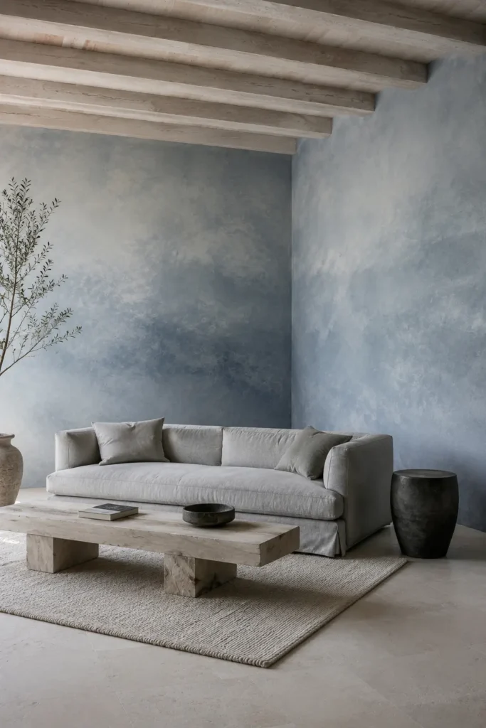
Mineral-blue limewash creates more movement than a flat blue wall. Its cloudy changes in tone can make the surface resemble mist, water, or a soft sky.
Use it throughout the room or on two connecting walls. Keep the furniture simple so the natural variation in the painted finish remains the main attraction.
Color palette: Mineral blue, chalk white, pale ash wood, soft charcoal
Why it works: Its tonal movement gives plain walls depth and atmosphere
Best for: Calm living rooms, coastal-modern homes, rooms with soft natural light
Style it with: Pale timber, washed linen, sculptural ceramics, charcoal accents
7. The Warm Khaki and Aubergine Door Portal
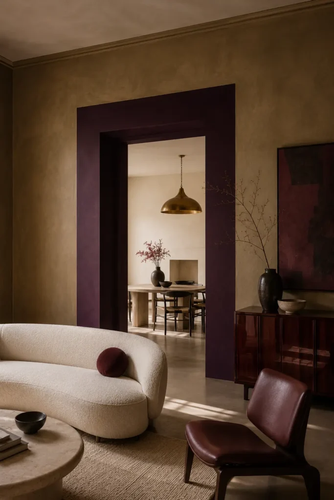
Paint the main living room walls in warm khaki, then turn a doorway into a bold feature by surrounding it with a thick aubergine-painted portal.
Continue the aubergine color through the doorway reveal and into a small portion of the adjoining room. The result gives a simple opening visual depth and makes the transition between rooms feel intentional.
Color palette: Warm khaki, aubergine, antique cream, dark cherry wood
Why it works: It adds drama without placing a dark color on every wall
Best for: Connected rooms, open doorways, contemporary eclectic interiors
Style it with: Cherry wood, burgundy textiles, aged brass, sculptural cream upholstery
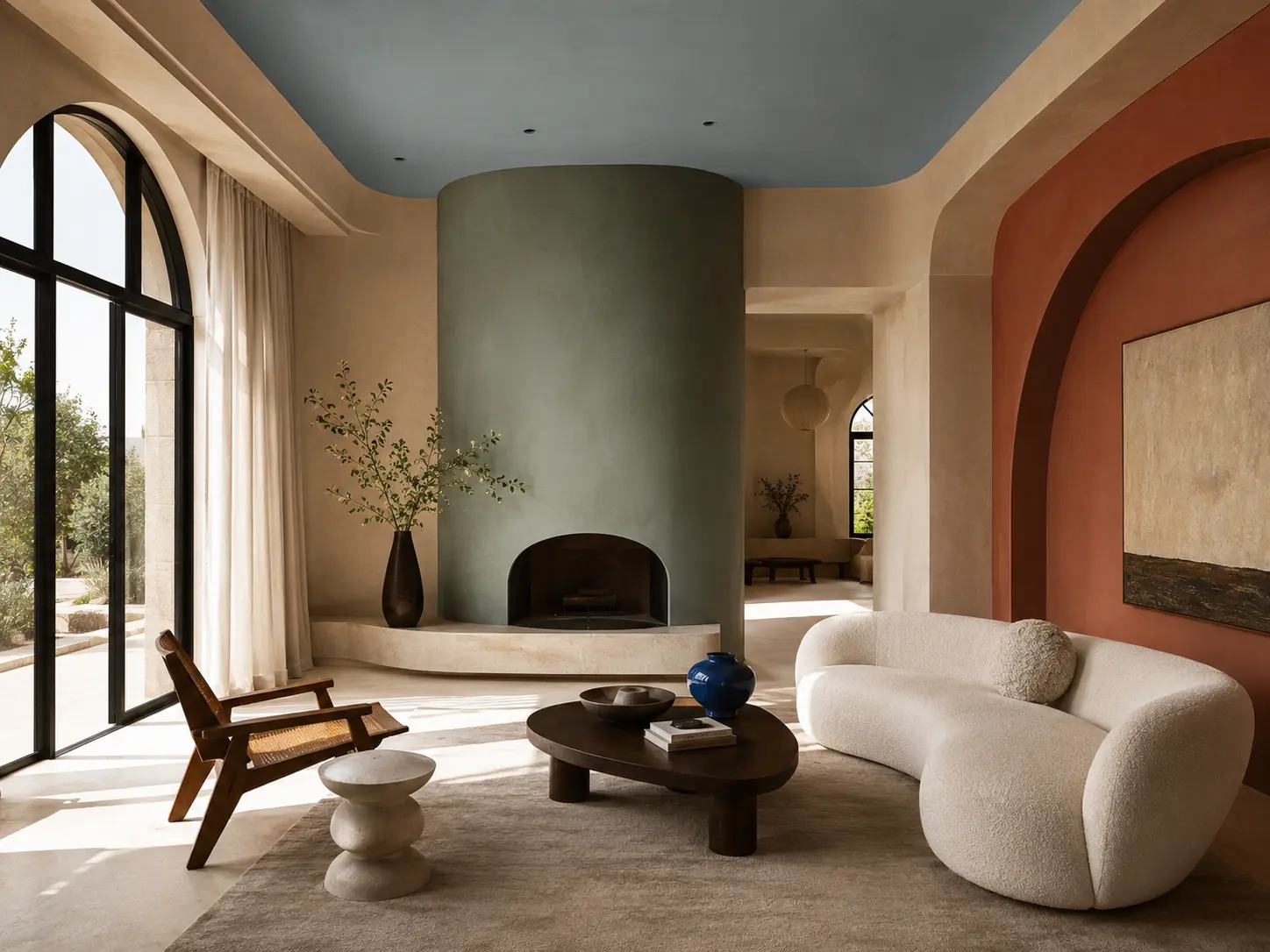
8. The Sky-Blue Ceiling and Warm Sand Walls
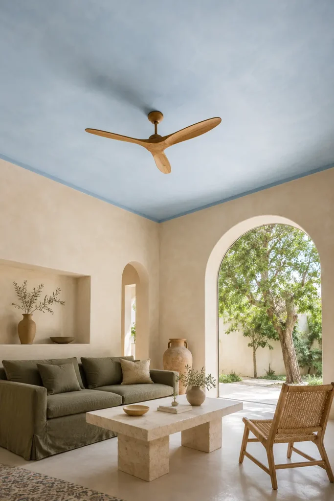
Bring color overhead with a muted sky-blue ceiling above warm sand-colored walls. The contrast resembles open sky over sun-warmed earth, giving the room a light, relaxed atmosphere.
A slim blue line just below the ceiling can help connect the upper color to the room rather than making it look like an isolated painted surface.
Color palette: Muted sky blue, warm sand, soft white, olive
Why it works: The blue ceiling visually lifts the room while warm walls keep it inviting
Best for: Small rooms, Mediterranean interiors, homes with strong daylight
Style it with: Olive upholstery, pale stone, natural oak, linen curtains
9. The Graphite Fireplace Frame with Saffron Insets
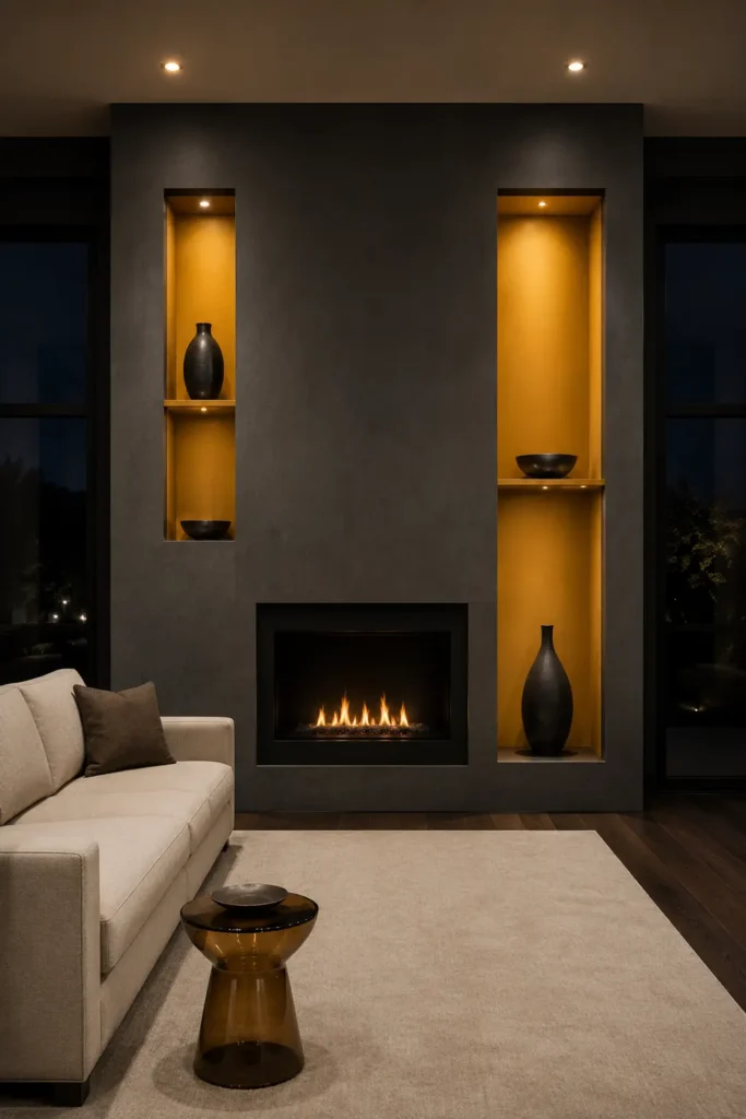
Create a dark graphite frame around the fireplace and introduce saffron inside the surrounding recesses or shelving niches.
The dark exterior gives the feature architectural weight, while the saffron interior catches light and creates an unexpected glow. This works especially well when shelves or shallow niches already surround the fireplace.
Color palette: Graphite grey, saffron, parchment, smoked oak
Why it works: The contrast adds depth and makes shelving appear illuminated
Best for: Modern living rooms, fireplace walls, dramatic grey color schemes
Style it with: Smoked oak, parchment upholstery, black metal, amber glass
10. The Soft Peach End-Wall Trick
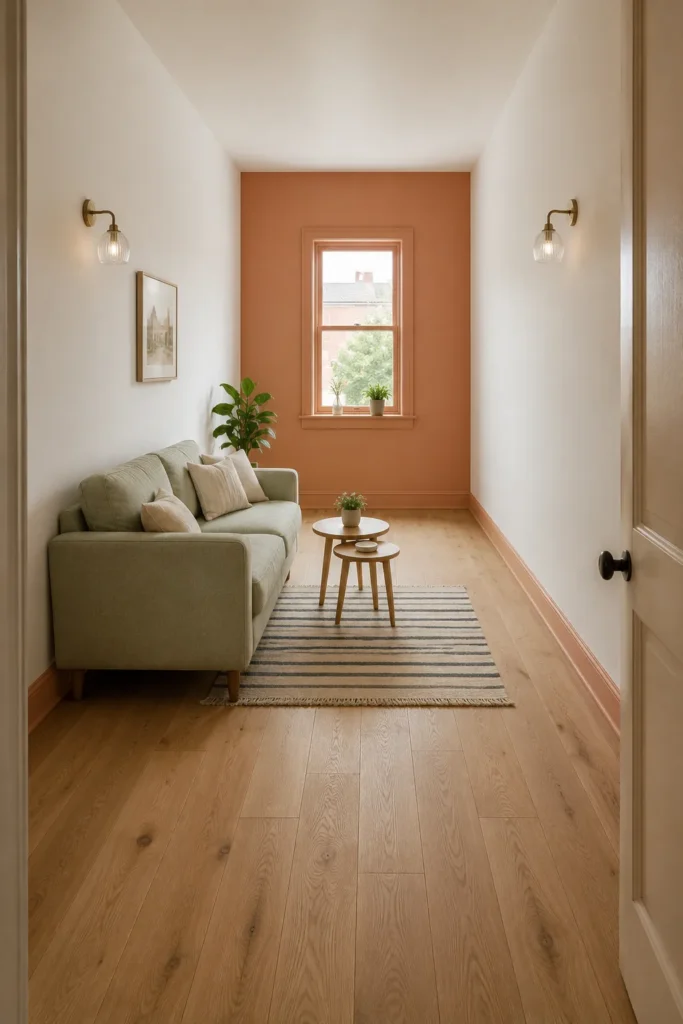
In a long, narrow living room, paint the far wall in soft peach while keeping the side walls a light warm neutral.
Warm colors appear visually closer, so the peach end wall can reduce the tunnel-like feeling of the room. Paint the far-wall trim in the same shade to make the treatment feel complete.
Color palette: Soft peach, warm white, pale oak, muted sage
Why it works: It visually shortens and balances a long narrow living room
Best for: Railway apartments, narrow lounges, small terraced homes
Style it with: Compact furniture, pale wood, slim lighting, small-scale patterns
11. The Olive-to-Terracotta Open-Plan Transition
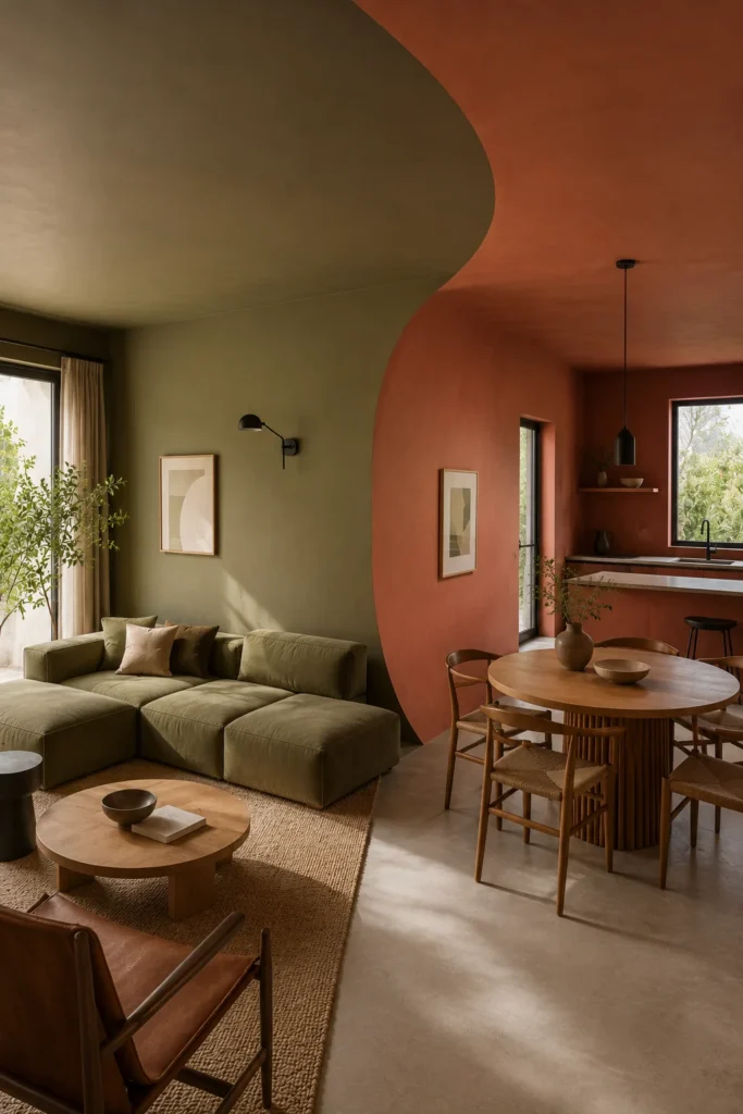
Use paint to define where a living room ends and the adjoining kitchen or dining space begins. Paint the living zone olive and the next zone terracotta, then overlap the colors in a large curved transition.
The overlapping area makes the change look intentional and artistic rather than like two disconnected rooms.
Color palette: Earthy olive, muted terracotta, warm cream, blackened bronze
Why it works: It creates visual zoning without walls or room dividers
Best for: Studio apartments, open-plan homes, living room and kitchen combinations
Style it with: Modular seating, black metal, warm oak, natural textiles
12. The Black-Cherry Jewel Box
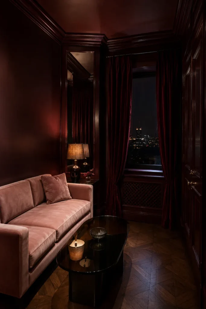
A compact living room can handle a rich color when it is applied deliberately. Paint the walls, ceiling, trim, and doors in deep black cherry, then use pale upholstery and reflective surfaces to balance the intensity.
Instead of making the room feel smaller, the consistent color can blur the boundaries and create a luxurious, enveloping atmosphere.
Color palette: Black cherry, pale blush, smoked glass, dark walnut
Why it works: Full color drenching transforms a compact room into an intimate retreat
Best for: Snug living rooms, formal lounges, evening entertaining spaces
Style it with: Pale velvet, smoked mirror, polished metal, dark floral textiles
13. The Curved Clay Wainscot
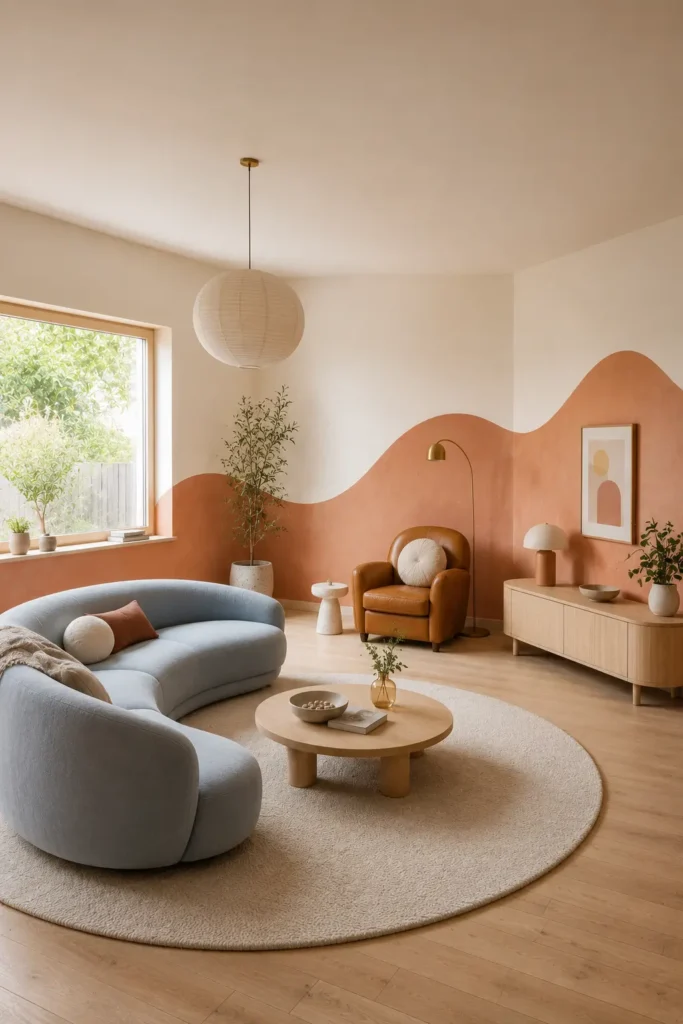
Replace a straight horizontal paint division with a wide clay-colored lower section that rises and falls in a gentle curve across the room.
The flowing line can rise behind a chair, dip below a window, and climb again around a reading corner. This gives the paint treatment an organic relationship with the room’s furniture and architecture.
Color palette: Soft clay, warm ivory, caramel, muted blue
Why it works: The flowing shape adds movement while protecting the lightness of the room
Best for: Playful modern interiors, creative apartments, family living rooms
Style it with: Curved furniture, caramel leather, pale timber, simple graphic art
14. The Warm White Room with Cobalt Window Pockets
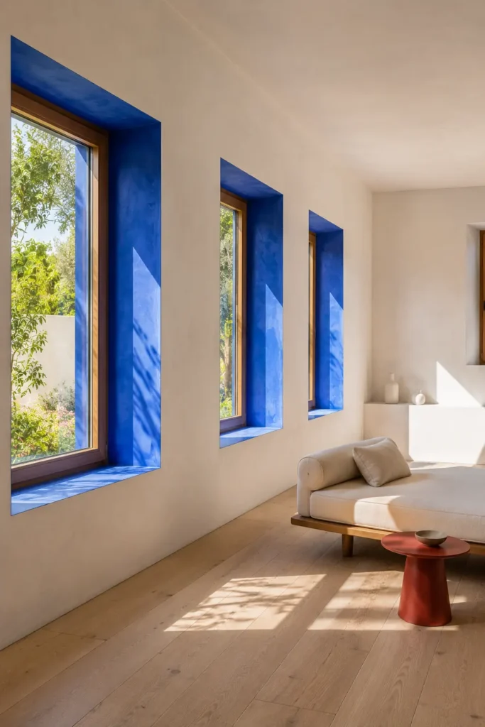
Keep the room predominantly warm white, but paint deep window recesses in intense cobalt blue.
Because the bold color is contained inside the architectural pockets, it creates a vivid moment without darkening the entire room. The blue also frames outdoor greenery or sky like a piece of artwork.
Color palette: Warm white, cobalt, natural oak, tomato red accents
Why it works: It introduces saturated color while preserving brightness
Best for: Minimal living rooms, thick-walled homes, rooms with deep windows
Style it with: Pale oak, linen seating, a few red accents, clean ceramic forms
15. The Slate-Blue Picture-Frame Wall
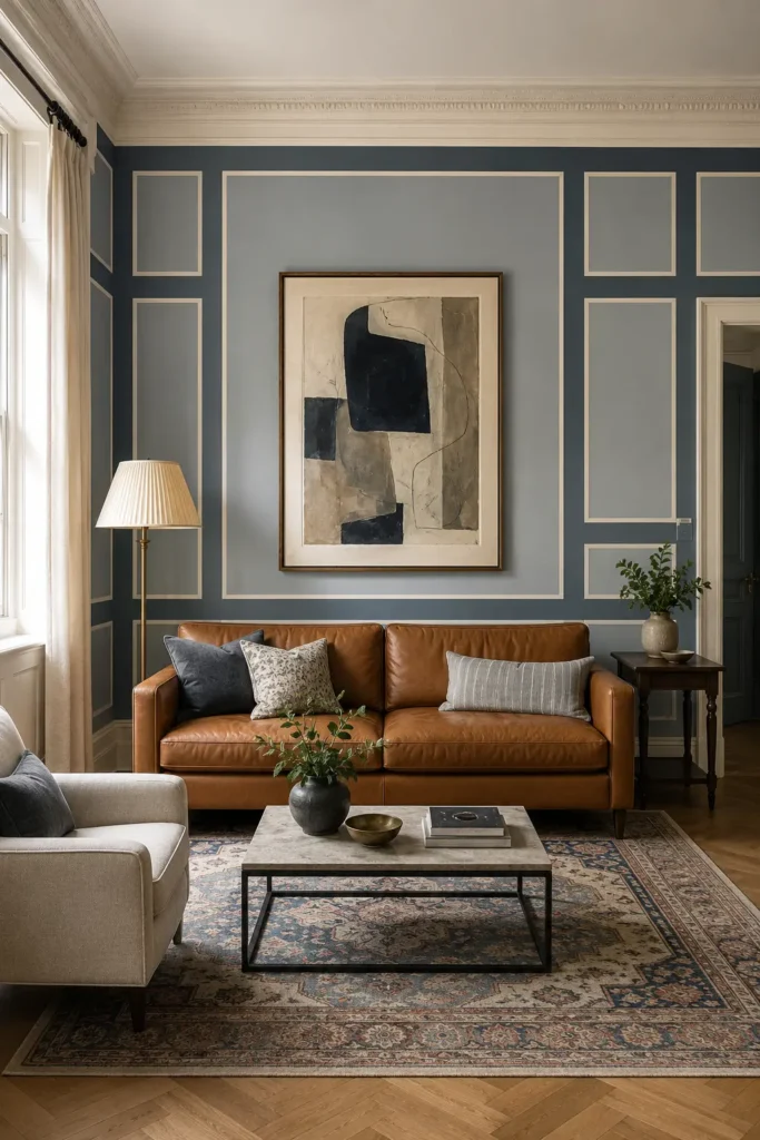
Use paint to create oversized picture-frame shapes rather than relying only on physical molding. Outline large rectangles in deep slate blue, fill the interiors with softer mineral blue, and leave narrow warm-white spaces between them.
The finished wall resembles custom paneling but feels more modern and graphic. It can frame artwork, a sofa, or a console without requiring major construction.
Color palette: Slate blue, mineral blue, warm white, cognac
Why it works: It adds tailored architecture to a plain wall using paint alone
Best for: Transitional living rooms, rentals, formal rooms without molding
Style it with: Cognac leather, pleated lampshades, classic rugs, contemporary art
16. The Modern Saffron and Indigo Arch Story
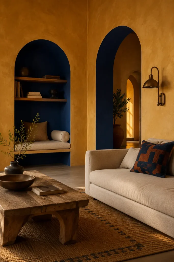
Combine muted saffron walls with deep indigo applied inside real architectural arches or broad painted archways. The rich colors feel expressive, but their earthy undertones keep the living room sophisticated.
Natural plaster, carved wood, woven textiles, and aged metal prevent the palette from appearing overly bright or themed.
Color palette: Muted saffron, deep indigo, warm plaster, aged teak
Why it works: The warm and cool contrast creates energy while remaining grounded
Best for: Modern Indian interiors, eclectic homes, colorful living rooms
Style it with: Aged teak, block-printed textiles, lime plaster, antique brass
How to Make Living Room Paint Colors Feel More Intentional
A successful living room color palette usually includes more than one wall shade. Even a simple scheme becomes more interesting when you consider the ceiling, doors, window recesses, fireplace, trim, and transitions into adjoining rooms.
Instead of adding several unrelated colors, select:
- One dominant wall color
- One architectural accent
- One supporting neutral
- One smaller furniture or textile color
The colors do not need to match exactly. They should share a similar undertone so the room feels connected.
Warm shades such as clay, khaki, saffron, peach, and terracotta usually pair naturally with cream, walnut, oak, and bronze. Cooler colors such as cobalt, mineral blue, jade, slate, and indigo can be softened with limestone, warm white, cognac, or natural linen.
Final Thoughts
The most memorable living room paint color ideas are not always based on the most unusual shade. They become memorable because of where the color is placed and how it changes the architecture.
A simple warm neutral can look extraordinary when it wraps the ceiling and trim. A strong cobalt blue can feel controlled when it remains inside window recesses. Terracotta can become a sculptural focal point when it forms an oversized painted sun behind the sofa.
Choose the idea that solves your room’s biggest challenge first. Then adapt its colors to suit your natural light, flooring, furniture, and personal style. The result should feel connected to your home rather than copied from a color chart.
Frequently Asked Questions
What is the best paint color for a small living room?
Light warm neutrals, soft mineral blues, pale apricot, gentle sage, and warm whites can help a small living room feel open. However, a dark color-drenched treatment can also work in a compact room when the goal is to create an intimate, jewel-box atmosphere.
Which living room paint colors make a dark room feel brighter?
Warm white, buttercream, pale apricot, soft peach, light khaki, and gentle sky blue can make low natural light feel warmer and more inviting. Avoid selecting a stark cool white without first testing it in the room, as it may appear grey in weak daylight.
Should living room walls and ceilings be the same color?
They can be. Painting the ceiling, walls, trim, and doors in related shades creates a soft color-drenched effect. For more contrast, pair warm neutral walls with a colored ceiling, such as sand walls with muted sky blue above.
How many paint colors should be used in a living room?
Most living rooms work well with two or three main paint colors. Use one dominant shade, one architectural accent, and one supporting neutral. Additional colors can appear through furniture, artwork, cushions, and accessories.
What paint colors work well in an open-plan living room and kitchen?
Choose related colors with similar warmth or intensity. Olive and terracotta, khaki and smoky jade, or warm white and mineral blue can create a natural transition. Paint can also be used to visually define each zone without adding physical walls.

Zain Abid
Founder & Managing Editor
Helping readers create warm, functional, and beautiful homes through practical decorating ideas and thoughtfully researched interior inspiration.
Read Full Profile →